excessive pride (or “overweening” pride), and is often called “the pride that comes before the fall.” It had serious consequences inGreek tragedy and law. (See about.com)
Home
> Uncategorized > Weekly Report, week ending, 1 February, 2013
Weekly Report, week ending, 1 February, 2013
CONTENTS
1.Australian Market. Indices: One-Week Performance. (The Week That Was.)
2.Australian Market. XJO – Monthly Chart (for the long-term investor)
3.Australian Market. XJO – Weekly Chart
4.Australian Market. XJO – Daily Chart
5.Australian Market. Relative Strength: XSO/XFL
6.Australian Market. Relative Strength: XEJ/XJO
7.International Markets: SP500 – 20YR/Quarterly
8.International Markets: SP500 – Daily
9.International Markets: FTSE Euro Top 100 – Weekly
10.International Markets: China88 – Weekly
11.International Markets: Nikkei 225 – Weekly
12.Hubris
13.Summary and Conclusion
14.SLF – Weekly
15.STW – Weekly
AUSTRALIAN MARKET:
THE WEEK THAT WAS.
INDICES ONE-WEEK PERFORMANCE
THE WEEK THAT WAS.
INDICES ONE-WEEK PERFORMANCE

Indices – One Week Performance
•XAO: +1.71%. Nine of 10 S&P Sectors were up.
•Best:
–Financials +2.8%
–Health +2.04%
–Cons. Disc. +2.04%
•Worst:
–Cons. Staples –0.14%
–Utilities +0.51%
–Energy +0.97%
•Risk:
–50-Leaders +1.89%,
–Small Ords. +0.82%
–Risk Appetite – Risk Averse.
–
•Gold Miners: -1.43%
• Property Trusts: +1.72%
•Generally a very strong week. Notable is the relative weakness of the Small Ords compared to the 50 Leaders. (See later section for more on this.)
AUSTRALIAN MARKET:
MONTHLY CHART – XJO
MONTHLY CHART – XJO

•The chart is currently at 4921.1. January was very strong, up nearly 5%. February has only traded for one day so far.
•The major horizontal resistance level around XJO 5000 is clear
•Stochastic, RSI and CCI are both overbought. They can remain so for months.
•This chart has a lot of positives. The uptrend is strong and remains above the 20-Month TMA, which has turned up. The chart possibly shows a move up to XJO 5000.
•We’re now close to four years since the end of the GFC. We’ve made no head-way in the past three years. The monthly high in January, 2010 was 4955.1. Until 5000 (round figures) is crossed to the upside this is still a secular bear market.
AUSTRALIAN MARKET:
WEEKLY CHART – XJO
WEEKLY CHART – XJO

•The XJO has now been up ten out of the past eleven weeks. The one down week was only marginally down (-0.3%)
•RSI.9 is at 83.5. That’s very overbought. We haven’t seen readings like that since the GFC started. Readings above 80 occurred frequently in the 2003/2007 bull market. So we shouldn’t presume that such a high reading is likely to produce a correction. In a bear market, such a presumption would be reasonable. In a bull market, it’s an indication of strength. Are we still in a bear market? That’s debatable. A break above horizontal resistance would suggest that the bear has gone (or at least, hibernating for now.)
•Stochastic and CCI are both overbought, but can remain so for weeks.
•The oblique restraining line (dotted line) shown on the chart suggests a potential “top” for this run-up could form around here. Given that it is more or less aligned with horizontal resistance, a pull-back seems likely.
•But – the trend from mid-2012 is up.
AUSTRALIAN MARKET:
DAILY CHART – XJO
DAILY CHART – XJO

•The XJO finished at 4921.1. First level of horizontal support is at 4859.9, then 4573.7. That’s a big gap.
•Indicators:
1.MACD Histogram. Above zero. Positive. Possible negative divergence setting up
2.MACD. Above zero. Positive. Possible negative divergence setting up.
3.RSI.9 is at 84.8. Very Overbought. Negative.
4.Stochastic. 93.7. Overbought.
5.CCI.14: +130.4. Overbought.
•I’ve shown a Standard Error Channel on the chart from June, 2012. Under “normal” circumstances, touches or piercing of the upper and lower lines are fairly reliable signals of at least a pending consolidation or correction. When the chart hits the upper boundary, it’s stretched too far to the upside – and a reversion to the mean (at least) occurs. That’s what we saw in August, 2012. In October, 2012, we saw a correction with the chart dropping to pierce. The overbought nature measured by the SEC can also be relieved by a sideways consolidation. But a continuation of the upward momentum is unlikely in the short term.
RELATIVE STRENGTH: XSO/XFL
AUSTRALIAN MARKET
AUSTRALIAN MARKET

•In bull markets, certain sectors tend to outperform – these are risk assets and tend to lead the market higher. It’s a general principle of technical analysis that without strength in those sectors any broad market rally is unlikely to be sustained.
•Small Ordinaries is considered to be a key “risk asset” across markets in all countries. Depending on the nature of the economy, various countries have different sets of risk assets. In Australia, for example, Materials and Energy are the two main “risk” sectors. In America, Technology is a good example of a “risk asset”.
•There are two panels in the above chart. The top panel shows the performance of the Fifty Leaders and the Small Ordinaries. The lower panel shows a Relative Strength indicator. Its derived by dividing the data for XSO by the data for the Fifty Leaders. Then normalised. (XFL is the benchmark for the blue chips – these are considered less risky assets than the Small Caps.)
•The Australian market (XJO) bottomed in early June, 2012. Since then the blue chip XFL is up +19.9%, while the risky Small Ords (XSO) is up only 10.9%. This is not what is expected in a bull market.
RELATIVE STRENGTH: XEJ/XJO
AUSTRALIAN MARKET
AUSTRALIAN MARKET

•Here’s another approach to the same issue. Energy (with Materials) is considered a good example of a risk sector in Australia. XJO is the benchmark for the broad market.
•Clearly XEJ (Energy) has been underperforming the broad market, but in a bull market we’d expect this to be a leader. The Relative Strength indicator shows graphically how poorly XEJ has performed compared to the broad market.
•Of particular interest is the fact that, despite the relative underperformance of XEJ, tops and bottoms in the two indices are highly correlated. XEJ is at a major horizontal resistance level. A fall here would suggest that the XJO will also fall.
•As mentioned above, the Australian market (XJO) bottomed in early June, 2012. Since then the blue chip XFL is up +19.9%, while the risky Small Ords (XSO) is up only 7.5%. This is not what is expected in a bull market.
•Until we see greater strength in XSO, XEJ and XMJ, the current rally must be viewed with suspicion.
INTERNATIONAL MARKETS:
SP500 – 20YR/Quarterly
SP500 – 20YR/Quarterly

•Looked at from a very long term perspective (20Years/Quarterly), this log-scale chart doesn’t promote a lot of confidence. There’s an oblique support resistance line going back to 1994 to be overcome. The chart pattern forming since the end of the GFC is a bearish rising wedge, a fairly reliable pattern.
•For this to prove itself as a new secular bull market, the chart needs to decisively break above the rising wedge and the 2000 high. Until that happens, I’ll presume the move up from early 2009 is a counter trend bear market rally. Nothing’s impossible, but the odds favour a pull back sometime in the not too distant future.
INTERNATIONAL MARKETS:
SP500 – DAILY
SP500 – DAILY

•The SP500 finished at 1513.17. Support/Resistance: 1466.12/1526.72.
•The Index was up 0.68% on the week – and up for the fifth week in a row. Six up in a row is rare.
•Indicators:
–MACD Histogram. Below zero. Negative.
–MACD. Above zero.
–RSI.9 is at 74.5. Overbought. Possible negative divergence setting up.
–Stochastic. 85.2. Overbought but below its signal line.
–CCI.14: +102.3. Marginally overbought. Possible negative divergence setting up.
•The market is overbought – that’s a negative. Some indicators showing possible negative divergences. The Money Flow Index, however, isn’t showing the characteristic negative divervences which appear from peak to peak before a turn down. There’s still no sign that the bulls are capitulating.
•The up trend remains intact.
•Since 1996 the broad indices for the American market (Dow 30 and SPX) every year have returned, more or less, to the level seen at the beginning of January. If history repeats, the sooner that event occurs the better for the market. If this bull rally continues, then, it’s likely we’ll get a very big crunch later in the year.
INTERNATIONAL MARKETS:
EUROPEAN TOP 100 – WEEKLY
EUROPEAN TOP 100 – WEEKLY

•The Euro Top 100 finished at 2392.07. Support/Resistance: 2300.85/2470.46.
•Unlike markets in Australia and America, the Index was down -0.63% on the week. The weekly candle is a narrow range one – hardly threatening.
•Indicators:
–MACD Histogram. Marginally above zero. Neutral.
–MACD. Above zero. Possible negative divergence.
–RSI.9 is at 64.3. Possible negative divergence setting up.
–Stochastic. 93.2. Overbought.
–CCI.14: +107.9. Marginally overbought. Possible negative divergence setting up.
•The market is overbought – that’s a negative. Some indicators showing possible negative divergences.
•There’s still no sign that the bulls are capitulating.
•The up trend remains intact.
INTERNATIONAL MARKETS:
CHINA88 – WEEKLY
CHINA88 – WEEKLY

•China88 is a Dow Jones Index made up of the blue chip stocks on the Shanghai and Shenzen stock exchanges.
•The Index finished at 237.26. Support/Resistance: 225.51/278.82.
•China had an exceptionally strong week, up +7.77%. That follows follows several strong weeks occurring since early Dec. 2012. It’s accelerating rather than slowing.
•Indicators:
–MACD Histogram. Above zero. Positive.
–MACD. Above zero. Positive.
–RSI.9 is at 79.5. Overbought.
–Stochastic. 93. Overbought.
–CCI.14: +138.7. Overbought. Possible negative divergence setting up.
•The market is overbought – that’s a negative.
•The market is accelerating to the upside. Such exponential rises invariably revert to the mean – but can go on for some time before doing so.
•Of major significance is the break of the very long term down trend in place from August, 2009. Both horizontal and oblique resistances have been dispatched. This is a positive for our market.
INTERNATIONAL MARKETS:
NIKKEI 225 – WEEKLY
NIKKEI 225 – WEEKLY

•Nikkei 225 is the broad market benchmark for the Japanese stock market.
•The Index finished at 11191.3. Support/Resistance: 10.982.1/11339.3.
•Japan had a strong week, up +2.42%. It’s now had 12 weeks up in a row. That’s stretched. Six in a row is rare.
•Indicators:
–MACD Histogram. Marginally above zero. Neutral.
–MACD. Above zero. Positive.
–RSI.9 is at 86.8. Overbought.
–Stochastic. 98.5. Overbought.
–CCI.14: +111.1. Overbought. Possible negative divergence setting up.
•The market is overbought – that’s a negative.
•Of major significance is the break of the very long term down trend in place from April, 2010. The uptrend is intact and close to the resistance of the April, 2010 high. Some sort of pause or retreat is likely after such a strong run.
HUBRIS
Hubris :
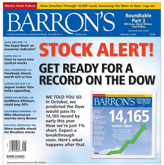
•Many years ago I read a fascinating book on contrarian investing. From memory I think it was by David Dreman one of the best known contrarian investors. He runs a highly successful fund and has also had a number of articles published in respected, referreed academic journals.
•One of the most vivid memories I have of that book is the principle that investors should get worried when front page stories in magazines predict new highs in the market.
•Well – there you have it with the current edition of Barron’s.
•But worse – Barron’s are also making the claim: WE TOLD YOU SO.
•It hasn’t happened yet. They’ll have egg on their face if it doesn’t happen. Of course, bragging rights will belong to them if it does. Unfortunately, they’re taking them already. Hubris? Perhaps a little modesty was due before the prediction was fulfilled?
•Of course, if it doesn’t happen, the tide of news will wash away memory of this page and and they’ll be free to make another outrageous front page claim – possibly a bearish one? Who knows. But – now I’m very, very worried. 🙂
COMMENTARY & CONCLUSION
First of all, a run down of the major world indices that I watch. Four out of five indices were up. The figures: XJO, +1.71%; SP500, +0.68%; Europe Top 100, -0.63%; China88, +7.77%; Nikkei, +2.42%. Once again, major world markets were more or less in sync. Europe is looking the weakest of these.
It’s not surprising that the Australian market is up nearly 20% since it bottomed in June, 2012 is performing well when its two major trading partners (China and Japan) are also performing well. Those two countries have seen their indices break out from very long term down trends. That’s a sign of some optimism.
All of the above data raises two important questions for me:
1.Are we now in a secular bull market? (Jim Puplava thinks so, and the Dow Theorists think we’re in a Primary Bull Market.) The answer to this question has important ramifications for a technical analyst like me. Indicators which, working together, did well in the past few years (since the GFC) pointing to possible tops and bottoms of the market may no longer work the same way. The But in 2003-2007 (a secular bull market) acting on such a readings would have had serious negative consequences for one’s bank balance.
2.Why are risky assets (e.g., Small Ords, Energy, Miners) in the Australian market failing to lead the market up. This question becomes more interesting in view of the breakout on charts for Chinese and Japanese markets (our two biggest trading partners)>
As far as Question One is concerned, I’m perplexed. We could be, i.e., in a new secular bull market. But the issue in Question Two suggests that we’re. If we’d turned the corner and moved out of a secular bear and into a secular bull, I’d expect the risk assets to be leading. When BHP and Rio are outperforming CBA and CSL, I might be convinced.
Next, the 20 Year Quarterly chart of the SP500 also suggests to me that the move up on that index from March, 2009, is a rally within a secular bear market. I could be proved wrong if certain conditions are fulfilled (see above in the section on the 20Yr/Quarterly) – but until that happens, I’ll be looking to exit this market when it has reached extremes. And the markets are now, in most cases, very overbought (according to bear market conditions). But maybe Puplava and the Dow Theorists are right. If they’re right – then – I guess I’ll have to recalibrate my thinking about indicators.
Next week? The market is so overbought after such a strong month (months?) it’s time for a breather. I think we’ll be down by the end of the week.
A reminder – every year since 1996, the American indices have, more or less, returned to the early January level at some time during the year. But – maybe history won’t repeat this year. Maybe this market will never, ever, ever go down again. And Barron’s won’t have to eat humble pie.
Remember: do your own research. Make your own decisions. I hope that the information I show might help you just a little.
For daily updates – check https://redbackmarketreport.wordpress.com/
ETF: SLF – WEEKLY

•This week I’ve continued to show the chart for XPJ – the Property Sector. I’ve mentioned before that SLF has low liquidity which means that prices on offer are often those offered by the market maker. They offer prices with a very wide spread. If you put in an “at market” order you’ll often end up with a price which is out of kilter with the underlying instrument. This also results in distortions in the tracking stock, SLF.
•This week the Property Sector was up, +1.72%. It’s been in a strong bull trend since August, 2011. Once again, it’s looking stretched to the upside (close to the top of the SEC) with overbought indicators – but no real sign that this bull rally is likely to end.
•The Property Sector is an interest rate sensitive sector. It’s borrowing costs go down and investors seeking income will switch out of other instruments (e.g., bonds and bank accounts) and into Property Trusts seeking higher dividends. While the RBA is in rate cut mode, it’s difficult to see how the Property Sector can suffer significant falls.
•According to Comsec, SLF Dividend Yield is 5.1%. That remains good value. Dividends are paid quarterly. Next dividend date is the end of March, 2013.
•(SLF is the Exchange Traded Fund which tracks the performance of the Property Sector on the Australian stock market.)
ETF: WEEKLY STW

•STW is the tracking stock for the ASX200.
•This week the ETF rose +1.75%. Take signals from the XJO chart.
•Dividend Yield: 3.7%. Dividends are paid half-yearly. Next ex-dividend date will be at the end of June.
•(STW is the Exchange Traded Fund which tracks the performance of the ASX200.)
Categories: Uncategorized
Comments (0)
Trackbacks (0)
Leave a comment
Trackback
